Thumbnails: The Click Trigger
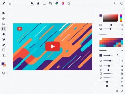
Before any other metric matters, you must secure the click. The algorithm tests your video on a small audience first. If the Click-Through Rate (CTR) is below average, impressions stop. It's a brutal, binary system.
The Psychology of Contrast
Your thumbnail sits on a mostly white or dark grey background (depending on the user's device theme). To stand out, you need high contrast. This doesn't mean chaotic colors; it means clear subjects separated from their backgrounds.
Simplify the Focus
Remove clutter. A thumbnail should convey the core concept in under a second. If there are more than three elements competing for attention, it's too complex.
Expressive Faces
Humans are hardwired to look at faces and process emotions instantly. A strong, authentic expression drives more curiosity than a blank stare.
The 3-Word Rule
If you use text, limit it to 3 or 4 words. The text should complement the title, not repeat it. Create a curiosity gap between the visual and the headline.
A/B Testing Methodology
Never rely on a single concept. Professional creators design three distinct thumbnails before they even shoot the video. Use YouTube's native testing features (or community tabs) to test concepts. If a video underperforms in the first 24 hours, swap the thumbnail immediately. Data beats intuition every time.